Wednesday, September 30, 2009

Jordan


I did a photo shoot with Jordan and I think some of the pictures turned out quite nice. It was a cloudy day so the lighting was perfect. Unfortunately Jordan is not a very cooperative model but she sure is beautiful.

Wednesday, July 22, 2009

Color Blind?

If your interested in color photography it might be advantageous to know if you are color blind or color deficient. Most forms of color blindness are genetic disorders that are inherited at birth. These disorders are most commonly carried in the X chromosome. Since females have two X chromosomes both have to be defective for the them to experience symptoms, but males only have one X chromosome so they are more likely to have symptoms of color blindness. In the book "Capturing Color" by Phil Malpas, he states that on a general average 8% of males and 0.5% of females suffer from varying degrees of color blindness.

There are a few types of color blindness protanope, deuteranope, and tritanope. Here is an example of how those who have these different types of color blindness see:

heidiblnd.jpg


Check and see if your color blind by taking a online test here.

roygbIv

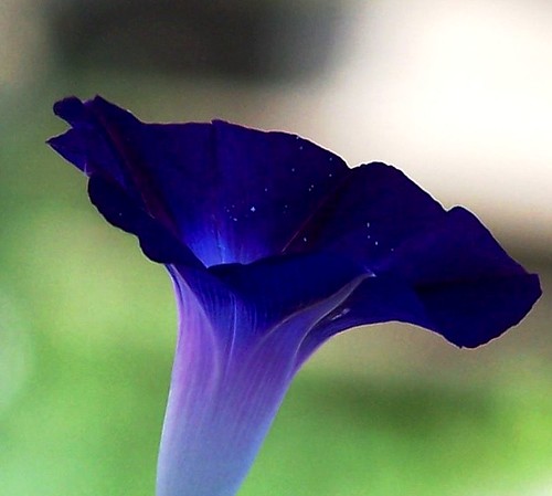
In this post I wanted to do a shout out to the color indigo because in my opinion it is the forgotten color of the rainbow. Now even though this picture is a little more violet than indigo I want to educate you on the color indigo (it was the closest thing I had to indigo so just use your imagination). Indigo is the hue that is between blue and violet, it has wavelengths of approximately 420-450 nanometers. Some of the other colors approximate wavelengths include:

Red        630-750
Orange  590-630
Yellow   570-590
Green    490-570
Blue       420-490
Violet    380-420

If you want check out a nice indigo image check out this link, the image in this link is not mine. So if you want to sound a little more educated you can identify things that are truly indigo and not violet, blue, or purple.

Tuesday, July 21, 2009

Final Monet (Photoshop)


I know I already showed you guys my Monet project, but I wanted to show you the finished project and tell you about a wonderful program called Photoshop.

All of my pictures go through Photoshop before you guys see them. Mainly because I have to clean up all the dust spots that get scanned in there. The whole process is kind of long and tedious but let me educate you a little.

Step 1: Get filmed developed ( I get it developed at Wallgreens)

Step 2: Take my film to the photolab and put it in a special esal that is made for 35 mm film

Step 3: Preview the pictures using the scaner

Step 4: Choose the best ones to really scan

Step 5: Have the computer scan the specific negatives that I want and have it save it to my jump drive.

Step 6: Open up the images in photoshop and clean up all the dust spots that got scanned in (even though I cleaned the scanner and the film). This step probably takes the longest because sometimes these dust spots show up on peoples faces or other places that have a lot of detail. When I fix these I have to copy different parts of the picture so the consistency of the image stays intact. 

Step 7 (optional): Adjust the color of the image so the color is more eye catching (I don't like to do this, just because it's not my style).

Step 8: Print on a 5x7, 8.5x11, 13x19, or a 17x22 sheet of luster paper.

Monday, July 20, 2009

Sunshine

"Sunshine... on my shoulder, makes me happy."
-John Denver-

This is my cousin Rachel... again. I wanted to dedicate this post to her. She is graduating this semester and I wanted to take a picture of her because is one the people I care about most here in Rexburg. Her sister Sarah calls Rachel "Sunshine" sometimes, so I thought the composition of this image was very appropriate. So I just want to say thanks Rachel for helping make my semesters here amazing. I love you cuz.

To I go along with the theme "Sunshine" I chose to take this picture right at sunset. Sometimes you'll hear a photographer talk about beautiful light most of the time it is in reference to sunrise or sunset. These are the best times of day to take beautiful pictures. The reason behind this is you don't get that direct harsh sunlight, it makes everything have a natural glow.

If any of you have taken physics you find out that light has a temperature associated with the color. Now you often hear people talk about how blues and violets are cool colors and oranges and reds are warm colors. When referencing actual color temperature this is not the case. Here are just a few examples:

Light Source     Color Temp (kelvins)
clear blue sky    20,000
hazy sunlight     9,000
overcast sky      7,000
morning sun     4,500
late afternoon sun 4,500
sun rise and set 2,000


Sunday, July 19, 2009

Motion

In photography sometimes the photographer wants to get a certain point across by showing motion in the picture. In this image, as you can see, one of the wheels is stationary and the other is rotating. I chose to take a picture of this because one of my wheels' barring is locked up and makes ridding a little harder. So If I ever go cruse with anyone else I have to work a lot harder to keep up.

The way you capture motion is by using a long shutter speed. This picture I used a 1 or 2 second shutter speed and had a tripod. A tripod is completely necessary if you want to have some clarity in you image.  Now when using a long shutter speed you have to be aware of the amount available. If you use a long shutter speed in the middle of a sunny day your image will be very bright and you will lose a lot of detail in the hot spots. Hot spots are areas where there is direct sunlight or there is something white in the image. I took this picture at 5:30 in the morning, the sun wasn't even up and this is how bright it turned out. So remember to think about the amount of light you have.

Thursday, July 16, 2009

God Bless America

This is another image from my series and I'll probably show you a couple more ;).

In this post I wanted to combine a few things that I love; America, longboarding, and photography. In reference to that love I thought this image deserved a little more respect. The way I gave my respect to this image was by taking my time and composing it well. Here's a few things that help make this a nice image:

Depth of field - the only things in focus are the board and the longboarder. Also the image is tight, there isn't a lot of empty space around the subject. These two things keep your attention on the subject.

Lighting - this image is back lit a gives a little bit of a silhouette feeling. The silhouette feature makes you focus on the shapes in the image and makes the lines sharp.

Color - Because the subject is back lit the colors in the image aren't as bright and vibrant. I like this touch because it limits the number of hues in the picture, which really can make an image ten times stronger. Also the colors are a little dark and I like this because it gives the image a more down to earth softer feeling, which helps maintain that respect.

Something that I hope you guys get from this blog is the urge to do your own thing! Don't do all the cliché things out there, make your pictures your own.

Wednesday, July 8, 2009

Longboard


Recently I decided I wanted to do a body of work, that would include longboarders as my subject. You know how I told you to put your own twist on things... well in this series I decided I wouldn't include the heads of my subjects. The reasoning behind this was I wanted to give the feel that each longboarder is different. Not because they look different but because they all have there own style, their own character, and there own body language.

When I was shooting this series I obviously didn't know most of these people and had to ask them if it would be okay to take there picture. Of course everyone let me take their pictures, because people love having there picture taken. Although it is important to be polite and courteous to your subjects (just a little manners lesson). But lets get down to the mechanics of this series... most of these were shot between 7 and 9 PM. While in search of longboarders I kept my shutter speed at around 180th of a second (so I could stop motion pretty well) and my f-stop at 16. It was pretty bright so in this situation, so i would want to decrease the amount of light hitting my film, that way I don't over expose my image. The best way to do that is to use a smaller aperture setting/higher f-stop number. On the lens I was using the f-stops ranged from 5.6 (biggest aperture) to 22 (smallest aperture). If you want to learn more about aperture go to http://en.wikipedia.org/wiki/Aperture.

Tuesday, July 7, 2009

Monet


I know I already talked to you about series, but here is another example I been working on for the past three months. 

The idea actually came from the famous artist Claude Monet. He would sit in the same spot and paint the Rouen Cathedral. He did around 26 paintings of the cathedral and each one is different because he would come back at different times of the year and different times of the day. Each painting reveals a different lighting. That lighting reveals the kind of verity you can get from the sun.

I just want to clarify to all you aspiring artists out there, that it is okay look at others work (even in a different medium) and get ideas of what you might be able to do. If you get an idea and put your own twist on it... that's okay. More than likely you aren't going to invent something that nobody else has thought of, it just isn't practical. I think it takes quite a bit of creativity to put your own twist on something, and make it represent you.

Sunday, June 28, 2009

Lighting


A recent assignment I had  was to experiment with different types of lighting. I was to use both natural and artificial lighting. We had to take at least one picture with natural light and artificial light simultaneously present. The above image was my example of natural vs. artificial. If you look closely on the artificial side you'll notice that the light being reflected in the door handle is green. The reason it is green is because the type of element used in the light. This light is mercury vapor light, that is why it is green.

Strangely enough our eyes do not see things quite as they are; an example of this is artificial light. There are a fare amount of different types of artificial lights and each of these lights tend to let off different colors. Mercury vapor lets off green color, high-pressure sodium lets off an orangey yellow color, and tungsten light is very orange. These types of light are the most common and appear to be white to us, most of the time.  Parking lots normally use sodium vapor bulbs because they use less energy; therefore the company that owns the lot can cut down on electric costs. The picture of the flowers is most likely sodium vapor light.

It is important to know these lights because they will affect the way your images come out. Especially if you don't have a flash and have to relay completely on the light around you to light your subject.

Thursday, June 25, 2009

Series


This was first time I did a photo shoot for someone other than my self. I took pictures of my brother Jake's family and this is his little girl. She's around one year old in these pictures and I think this was the first time she had gone out in the snow. The series above is representing the fist time she had tasted snow. 

Often photographers use a body of work or a series to get a certain point across. Now for this to be affective there needs to be some kind of common theme. If there isn't a theme what is the difference between you body of work and a bunch of random pictures. A series brings different strengths to the table. It can make what your trying to say much more obvious or it can help show a chain of events. One of the things I think a series establishes is change. The change from one picture to another is more evident and gets people thinking about how these changes occur. I also think that a series can do quite the opposite and show the consistency of something. An example may be shooting different baseball diamonds around the United States. They are all going to have the same basic structure. So if you have a point you want to get across, maybe think about using a series a tool.

If you want to check out a couple examples of series go ahead and check out these links (I really like Noah)...

Sunday, June 21, 2009

Portraits


If you ever wondered what my beautiful model Geri looked like, well here is your chance to check her out. This photo was taken in July of 2008.
The word portrait has a couple different meanings to a photographer. It can either mean your subject is a person or that the picture is taller than it is wide. This image is  an example of both.

When you think of a portrait most people think of a picture of a person against a tree or with a cool gray background. This is not always the case and I encourage you to branch out a little. When making a portrait it can be very effective to capture a person while they are doing some of their most natural behaviors. Here are a couple more examples of portraits I've taken...

This was among my first successful images. I took this picture in high school. This is my dad, I took this picture while he was talking to someone, he didn't even notice.

This image is of my beautiful cousin Rachel. She was so kind to let me take pictures of her throughout the day so I could a capture a her in a little more down to earth image. Also this image is an example of using medium lighting (check out the "Light" post if you don't know what medium light means).

An example of these more natural portraits is the work of the photographer Catherine Opie. If you check out her web site you can see a portrait of my sister Larkie. It's the 18th image (images 11-13, and 24 have some nudity in them just as a warning) I like the one of the football player holding his pads over his shoulder (image 7).

Friday, June 19, 2009

Man Hole


Abstract art it an interesting concept. Images tend to reflect the artist more because their images show what they see or how they are able to look at something ordinary in a different perspective.

When I took this image a it was raining and the paint on the cover was very vibrant. This caught my eye so I thought I'd experiment with it. What I did was lay down on the ground (I was wearing a white shirt at the time), line up the grid of the cover so that it was in that V shape (your eyes tend to follow certain patterns more easily than others, examples are a V shape or a Z shape), and used a large aperture so I could get that narrow depth of field. Since it was a cloudy day I didn't get any shadows and I think this helped make the image more simple.

In our world colors tend to represent certain feelings, ideas, or can influence attitudes. Green has a strong connection with safety (green light means it's safe to cross the intersection), and it can imply self-control and renewal. Also green has a relaxing effect on us, by looking at something green it can help relax your eyes. These calming properties are used by television companies; they will have their guests sit in green rooms to help relax them before they make an appearance. Green can present different ideals in different cultures too. In America green is associated with a rise in the stock market, while in Asia it represents a fall in stocks or shares. It is truly amazing how a single color can influence us so much.

Wednesday, June 10, 2009

Bouldering

This image isn't one of my higher quality images, but that is okay by me because it is the idea behind it that I like. For my color photo class my current assignment is a photo journal of meaningful photos. Any one can just snap a photo but not everyone thinks about what they want to say in there photos. In this photo I wanted to represent a new found love in my life... bouldering.
This photo involved a lot of techniques coming together:
1)Positioning your camera
-To take this photo I had to find a rock or something that I could trust would keep my camera steady. Also this rock position had to allow me to see through the camera so I could know where I was shooting (I don't own a tripod).
2)Focusing
-This time focusing wasn't as easy as it always is. I had to guess where my body would be and hope it would be in pretty good focus. Reason being I wouldn't be able to stand behind the camera and see the fine details. So what I did was look at the rocks around the area where my body would approximately be and see if they were in focus.
3)Bracketing
-Bracketing is actually pretty easy. When your in a setting that is poorly lit (too bright or too dark) and your worried about getting a good exposure bracketing is the way to go. What it consists of is keeping one of your setting constant, shutter speed for example, while changing another, aperture(F-stop). Example- shutter speed 125th of a second, F-stop 11, and click. Next, shutter speed 125 still, F-stop 16, and click. Next, shutter speed 125, F-stop 8, and click. Just a reminder the lower your F-stop number the more light your letting in. Most modern day cameras have light meters so you don't have to do bracketing as much, but it is a good thing to know just incase that breaks.
4)Arm strength
-This wasn't the easiest self-portrait to take. This position took a little strength, especially since I had to do it a few times. Bouldering isn't easy, but that is why I like it because if it was then everyone would do it.


Thursday, June 4, 2009

I Wear My Sunglasses...

In photography a lot of the time a photo reflects on how the photographer is feeling or represents something important to them. In this photo I wanted to capture something simple. To keep the simplicity of the photo I decide to make it monochromatic (dealing mostly with one color) and to have my subject be every day things (sunglasses and blue jeans). Another thing I wanted to do is subtly incorporate myself into the picture. If you look at the lens that Geri's finger is on, you can see me in the reflection.

Sometimes photographers want bring them selves into the photo by a reflection, shadow, or simply taking a picture of them selves. This is something that always intrigues me because as a photographer you spend the majority of your time time taking photos behind the camera. Most of the time the only way to represent yourself is to photograph something that represents you or how you see things. Photography is a way to show other people how you see things, and can be a very personal thing.

Yesterday I learned about a photographer named Sam Abell. He was a photographer for National Geographic for over 30 years. He stated working for them having never taken a photography class before. Something that I really appreciated that he did was that he didn't alter his photos with a flash, a filter or anything. His photos are very true to life and that is his style. If you like really down to earth photos check out his web site. My favorite is the one with the woman in a blue rob (it's his wife). He has a small summary about each photo and they show how personal they are to him.

Friday, May 22, 2009

A little Country

When I took this photo I took I first took it with the sun behind me. It was a nice picture, but this one has light coming form the side bringing a whole new element to the photo (I love it). Light is the key to photography. It is a photographers paintbrush and easel, and light is a tool that needs to be understood and mastered.   

Saturday, May 16, 2009

Isolated Color

In this photo I was experimenting with isolated color. Sometimes isolated color is much more effective than taking a picture with a ton of  color. I heard a interesting quote in my photo class it goes, "a thimble of red is much more than a bucketful." I don't know who said it but the concept is very true. 

Just a reminder magenta and the green are complementary colors. Check out the color wheel post if you don't remember what the other complementary colors are. :)

Monday, May 4, 2009

Light

This photo was taken near Porter Park in Rexburg Idaho. I lined up the sun so that it would be in the middle of the street lamp, giving the lamp the appearance that it was on, in the middle of the day. 

In this picture I was trying to demonstrate the use of a small light source. The sun is a prime example of a small light source. Small light sources are when the light comes from a concentrated point. Small light sources also can create a sort of harsh light; making dark shadows and bright highlights.  This is why if a photographer has to take pictures in the middle of the day they will have a flash, so they can lighten up those dark shadows.

A good example of a large light source is a cloudy day. On a cloudy day the whole sky is your light source and you don't really get any shadows or a lot of highlights. Cloudy days are my favorite days to go and shoot in the middle of the day.

There are also medium light sources and a good example of that is when you are taking a picture in doors, your source of light is a window, and outside is cloudy. This will create faint shadows and highlights. But, if it is sunny outside that window can become a small light source.

Thursday, April 30, 2009

Cingular

The shorts in this photo are mine, I ripped them when I crashed on my longboard. I had my cellphone in my pocket at the time, so where my cellphone was was where they ripped. I still own these shorts and still remain as my favorite shorts. I want say special thanks to Geri Howe. Without her this picture would not have been possible. As you can see she is a fantastic model and you will see more of her in other photos. Thanks Geri

In this particular photo I was trying to demonstrate having a shallow depth of field. You probably noticed that most of the picture is out of focus, well shallow depth of field is when your trying to focus on only a small part of the photo, i.e. the ripped part of the pocket. The best why to create a small depth of field is to use a large aperture. Aperture is the hole on your camera that controls how much light comes in, much like the iris in your eye controls how much light comes in.

Monday, April 27, 2009

Color Wheel

I took this photo to demonstrate the color wheel used in photography. It is a little different than the regular color wheel which includes red, orange, yellow, green, blue, and violet. The color wheel used in photography is red, yellow, green, cyan, blue, and magenta. Colors that are opposite on the color wheel are complimentary i.e., red and cyan, yellow and blue, and green and magenta.

Favorite Shoes


This is my self portrait, I took this photo in July of 2008. I chose these shoes as my subject because, something I believe in is that you can tell a lot about a person just by looking at their shoes.

 One of the reasons why I think this photo came out nicely is because it follows the rule of thirds, this can help make the photo more ascetically pleasing. The basic principle behind the rule of thirds is to imagine two sets of parallel lines (one set horizontal and the other vertical) cutting the photo into thirds, and making 9 boxes. Where these lines intersect are points of interest (the four corners of the center box).  In this photo my high-heel hits two, almost three of these focal points, therefore it catches your eye.
If you want to learn more about the rule of thirds you can visit this web sight, http://digital-photography-school.com/rule-of-thirds