Wednesday, July 22, 2009

Color Blind?

If your interested in color photography it might be advantageous to know if you are color blind or color deficient. Most forms of color blindness are genetic disorders that are inherited at birth. These disorders are most commonly carried in the X chromosome. Since females have two X chromosomes both have to be defective for the them to experience symptoms, but males only have one X chromosome so they are more likely to have symptoms of color blindness. In the book "Capturing Color" by Phil Malpas, he states that on a general average 8% of males and 0.5% of females suffer from varying degrees of color blindness.

There are a few types of color blindness protanope, deuteranope, and tritanope. Here is an example of how those who have these different types of color blindness see:

heidiblnd.jpg


Check and see if your color blind by taking a online test here.

roygbIv

In this post I wanted to do a shout out to the color indigo because in my opinion it is the forgotten color of the rainbow. Now even though this picture is a little more violet than indigo I want to educate you on the color indigo (it was the closest thing I had to indigo so just use your imagination). Indigo is the hue that is between blue and violet, it has wavelengths of approximately 420-450 nanometers. Some of the other colors approximate wavelengths include:

Red        630-750
Orange  590-630
Yellow   570-590
Green    490-570
Blue       420-490
Violet    380-420

If you want check out a nice indigo image check out this link, the image in this link is not mine. So if you want to sound a little more educated you can identify things that are truly indigo and not violet, blue, or purple.

Tuesday, July 21, 2009

Final Monet (Photoshop)


I know I already showed you guys my Monet project, but I wanted to show you the finished project and tell you about a wonderful program called Photoshop.

All of my pictures go through Photoshop before you guys see them. Mainly because I have to clean up all the dust spots that get scanned in there. The whole process is kind of long and tedious but let me educate you a little.

Step 1: Get filmed developed ( I get it developed at Wallgreens)

Step 2: Take my film to the photolab and put it in a special esal that is made for 35 mm film

Step 3: Preview the pictures using the scaner

Step 4: Choose the best ones to really scan

Step 5: Have the computer scan the specific negatives that I want and have it save it to my jump drive.

Step 6: Open up the images in photoshop and clean up all the dust spots that got scanned in (even though I cleaned the scanner and the film). This step probably takes the longest because sometimes these dust spots show up on peoples faces or other places that have a lot of detail. When I fix these I have to copy different parts of the picture so the consistency of the image stays intact. 

Step 7 (optional): Adjust the color of the image so the color is more eye catching (I don't like to do this, just because it's not my style).

Step 8: Print on a 5x7, 8.5x11, 13x19, or a 17x22 sheet of luster paper.

Monday, July 20, 2009

Sunshine

"Sunshine... on my shoulder, makes me happy."
-John Denver-

This is my cousin Rachel... again. I wanted to dedicate this post to her. She is graduating this semester and I wanted to take a picture of her because is one the people I care about most here in Rexburg. Her sister Sarah calls Rachel "Sunshine" sometimes, so I thought the composition of this image was very appropriate. So I just want to say thanks Rachel for helping make my semesters here amazing. I love you cuz.

To I go along with the theme "Sunshine" I chose to take this picture right at sunset. Sometimes you'll hear a photographer talk about beautiful light most of the time it is in reference to sunrise or sunset. These are the best times of day to take beautiful pictures. The reason behind this is you don't get that direct harsh sunlight, it makes everything have a natural glow.

If any of you have taken physics you find out that light has a temperature associated with the color. Now you often hear people talk about how blues and violets are cool colors and oranges and reds are warm colors. When referencing actual color temperature this is not the case. Here are just a few examples:

Light Source     Color Temp (kelvins)
clear blue sky    20,000
hazy sunlight     9,000
overcast sky      7,000
morning sun     4,500
late afternoon sun 4,500
sun rise and set 2,000


Sunday, July 19, 2009

Motion

In photography sometimes the photographer wants to get a certain point across by showing motion in the picture. In this image, as you can see, one of the wheels is stationary and the other is rotating. I chose to take a picture of this because one of my wheels' barring is locked up and makes ridding a little harder. So If I ever go cruse with anyone else I have to work a lot harder to keep up.

The way you capture motion is by using a long shutter speed. This picture I used a 1 or 2 second shutter speed and had a tripod. A tripod is completely necessary if you want to have some clarity in you image.  Now when using a long shutter speed you have to be aware of the amount available. If you use a long shutter speed in the middle of a sunny day your image will be very bright and you will lose a lot of detail in the hot spots. Hot spots are areas where there is direct sunlight or there is something white in the image. I took this picture at 5:30 in the morning, the sun wasn't even up and this is how bright it turned out. So remember to think about the amount of light you have.

Thursday, July 16, 2009

God Bless America

This is another image from my series and I'll probably show you a couple more ;).

In this post I wanted to combine a few things that I love; America, longboarding, and photography. In reference to that love I thought this image deserved a little more respect. The way I gave my respect to this image was by taking my time and composing it well. Here's a few things that help make this a nice image:

Depth of field - the only things in focus are the board and the longboarder. Also the image is tight, there isn't a lot of empty space around the subject. These two things keep your attention on the subject.

Lighting - this image is back lit a gives a little bit of a silhouette feeling. The silhouette feature makes you focus on the shapes in the image and makes the lines sharp.

Color - Because the subject is back lit the colors in the image aren't as bright and vibrant. I like this touch because it limits the number of hues in the picture, which really can make an image ten times stronger. Also the colors are a little dark and I like this because it gives the image a more down to earth softer feeling, which helps maintain that respect.

Something that I hope you guys get from this blog is the urge to do your own thing! Don't do all the cliché things out there, make your pictures your own.

Wednesday, July 8, 2009

Longboard


Recently I decided I wanted to do a body of work, that would include longboarders as my subject. You know how I told you to put your own twist on things... well in this series I decided I wouldn't include the heads of my subjects. The reasoning behind this was I wanted to give the feel that each longboarder is different. Not because they look different but because they all have there own style, their own character, and there own body language.

When I was shooting this series I obviously didn't know most of these people and had to ask them if it would be okay to take there picture. Of course everyone let me take their pictures, because people love having there picture taken. Although it is important to be polite and courteous to your subjects (just a little manners lesson). But lets get down to the mechanics of this series... most of these were shot between 7 and 9 PM. While in search of longboarders I kept my shutter speed at around 180th of a second (so I could stop motion pretty well) and my f-stop at 16. It was pretty bright so in this situation, so i would want to decrease the amount of light hitting my film, that way I don't over expose my image. The best way to do that is to use a smaller aperture setting/higher f-stop number. On the lens I was using the f-stops ranged from 5.6 (biggest aperture) to 22 (smallest aperture). If you want to learn more about aperture go to http://en.wikipedia.org/wiki/Aperture.

Tuesday, July 7, 2009

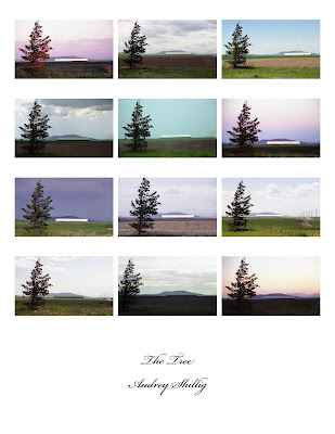
Monet


I know I already talked to you about series, but here is another example I been working on for the past three months. 

The idea actually came from the famous artist Claude Monet. He would sit in the same spot and paint the Rouen Cathedral. He did around 26 paintings of the cathedral and each one is different because he would come back at different times of the year and different times of the day. Each painting reveals a different lighting. That lighting reveals the kind of verity you can get from the sun.

I just want to clarify to all you aspiring artists out there, that it is okay look at others work (even in a different medium) and get ideas of what you might be able to do. If you get an idea and put your own twist on it... that's okay. More than likely you aren't going to invent something that nobody else has thought of, it just isn't practical. I think it takes quite a bit of creativity to put your own twist on something, and make it represent you.